 Shareforce vraagt om je toestemming om meldingen te kunnen sturen.
Responsive design the new standard
04 June 2013 - John Kivit
More and more websites are visited from a mobile device. A responsive website that adapts to the screen of the visitor is a must and the new standard. A responsive design looks good on a smartphone, tablet and desktop. It automatically adapts to serve an optimal user experience.
An important driver for mobile visits to websites is e-mail. Today, about 43% of all e-mail is read on a mobile device. Visitors read mail and click on links to visit your website. Another important factor is the fact that mobile search is growing rapidly. The share of mobile searches at the end of 2013 is estimated at 27%.
Real world examples
I was curious what the mobile share is on websites that I am involved with. Google Analytics has an excellent feature for this. These are the mobile shares of some websites (May 2013):
- Shareforce – 81%
- Panelteam – 64%
- Marketingreis – 30%
- Marketing Pioneers – 13%
- Multiscope – 11%
- Exelirent – 7%
Notice the differences. This can be explained by their strategy. Shareforce has a huge focus on mobile. Exelirent is a corporate website without any mobile optimization. But on average 34% of all visitors surf on the websites with a mobile device (including tablets). The iPhone, iPad and Samsung Galaxy are by far the most popular devices.
The high penetration in e-mail, search and the actual visits on websites justify the conclusion that a responsive design should be the new standard. Your visitors just want it to look good, no matter what device he / she uses!
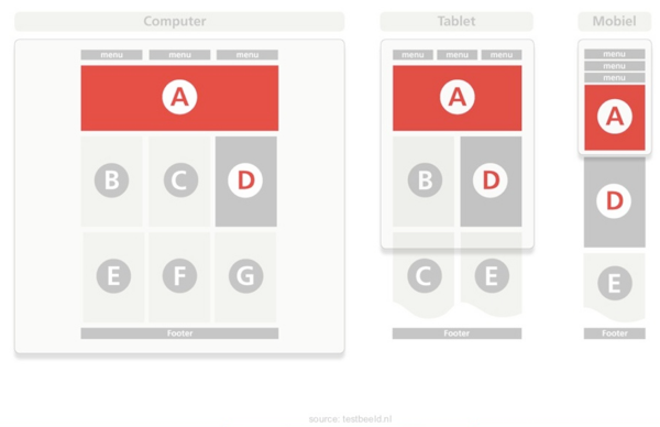
How does it work?
A responsive design has three basic techniques under the hood that make sure everything works as it is supposed to be:
- Media queries: serving the right CSS file with some basic formatting rules based on the recognition of screen size.
- Flexible grid: scales and positions elements inside the browser window
- Dynamic content: text, pictures and videos in the right size inside this flexible grid.
Because one picture says more than a thousand words you can find an example below:
The website you are looking at right now is completely dynamic and responsive. Try it yourself by visiting Shareforce.nl from a mobile, tablet and desktop. But you can also try Marketingreis.nl. It also serves the right content for your device.
Want to know more about responsive design? Check the presentation below that I did at the Mobile Pioneers conference in April. It brings you up to speed about this relatively new technique. Contact us if you need a responsive site and let us surprise you with all the possibilities.